Community Compass
When you are in need of assistance, like many in today’s current environment, finding available resource facilities can be confusing and overwhelming. Community Compass is designed to make the process easier for anyone needing assistance and is a one stop shop to locate assistive resource facilities in their local communities.
PROJECT OVERVIEW
PRODUCT
Community Compass is a non-profit organization based in Omaha, NE. They focus on helping those in need find available resources. This can include food, clothing, housing, transportation, health and other services. The organization needs a tool that helps people quickly and easily find resource facilities in their local community. Community Compass’ primary target users include homeless, seniors, the disabled, veterans, and anyone needing assistance. It allows users to view facilities, provides directions and maps, displays hours of operation, amenities and so much more.
MY ROLE AND RESPONSIBILITIES
I was the sole designer involved in this project. I performed all tasks ranging from conducting research, interviews, ideation, creating wireframes and all prototypes, conducting user testing, and gathering testing feedback and iterating on designs.
PROJECT DURATION
2.0 Months
PROBLEM
3 in 10 people within the community, with 1 in 7 being children, are struggling to make ends meet or face food insecurity. The strategy team at Community Compass has identified a lack of awareness and access to available facilities that provide services to those in need.
GOAL
Design a responsive website and app that will allow any user to easily and quickly search and locate available resource facilities, and the services they provide in their community.
UX DESIGN PROCESS
UX RESEARCH SUMMARY
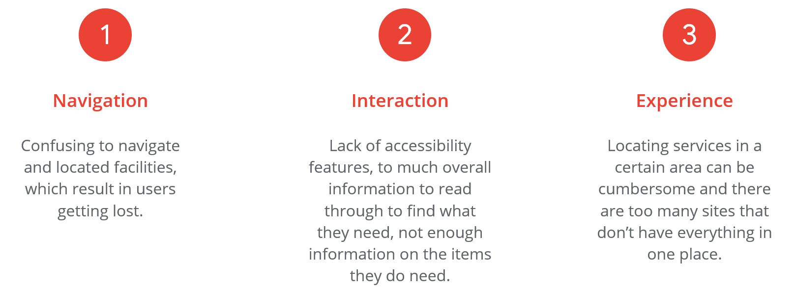
I used Community Compass’ impact statement to develop interview questions, which were then used to conduct user interviews. Most interview participants reported feeling as if they could not easily locate available facilities or could not make it to a facility, or the hours would not work for them. The feedback received through research made it very clear that users would like to be able to locate facilities close to them and be able to view the services they provide.
USER RESEARCH: PAIN POINTS
PERSONAS
PROBLEM STATEMENT
Monica is a single mother and working student who needs to quickly and easily locate resource facilities that are open later in the evenings to accommodate her work and school schedules. She also would like to see what services they facility provides at a quick glance.
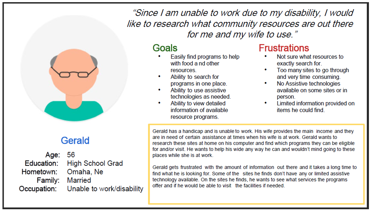
Gerald is disabled and unable to work. He has a hard time locating available resource facilities online and wishes he could find them in one place instead of different sites. He wants to help his wife any way he can but is unable to drive so he would need to ensure facilities provide transportation and are handicap accessible.
COMPETITIVE ANALYSIS
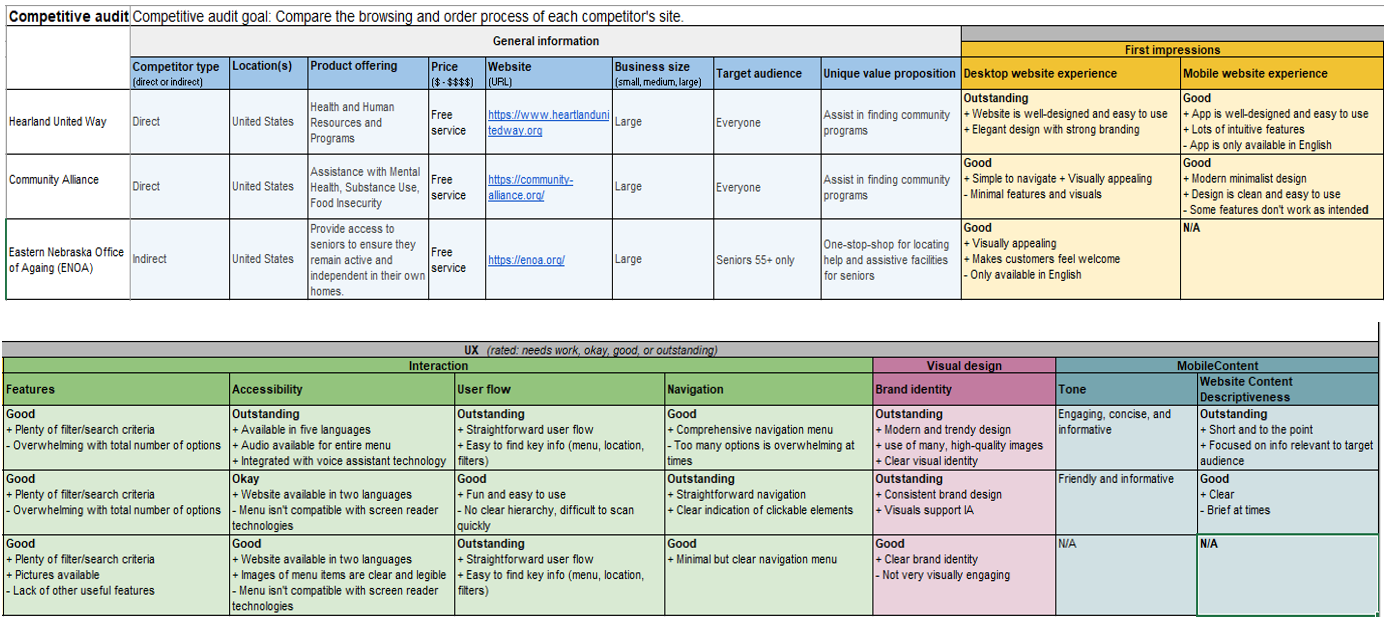
I conducted an audit of a few competitor’s products. These results provided me direction on gaps and opportunities to address with the Community Compass app/website.
STARTING THE DESIGN
SITEMAP
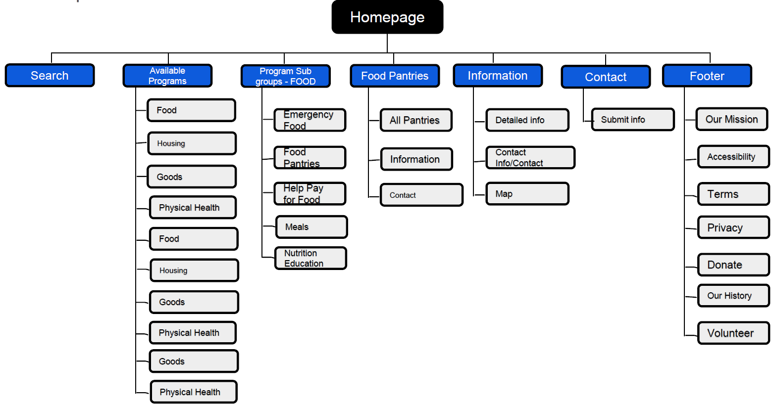
I created a site map to begin the design process. I needed to figure out the website’s information architecture and where the different links would lead. This would also help with the organization and labelling of content.
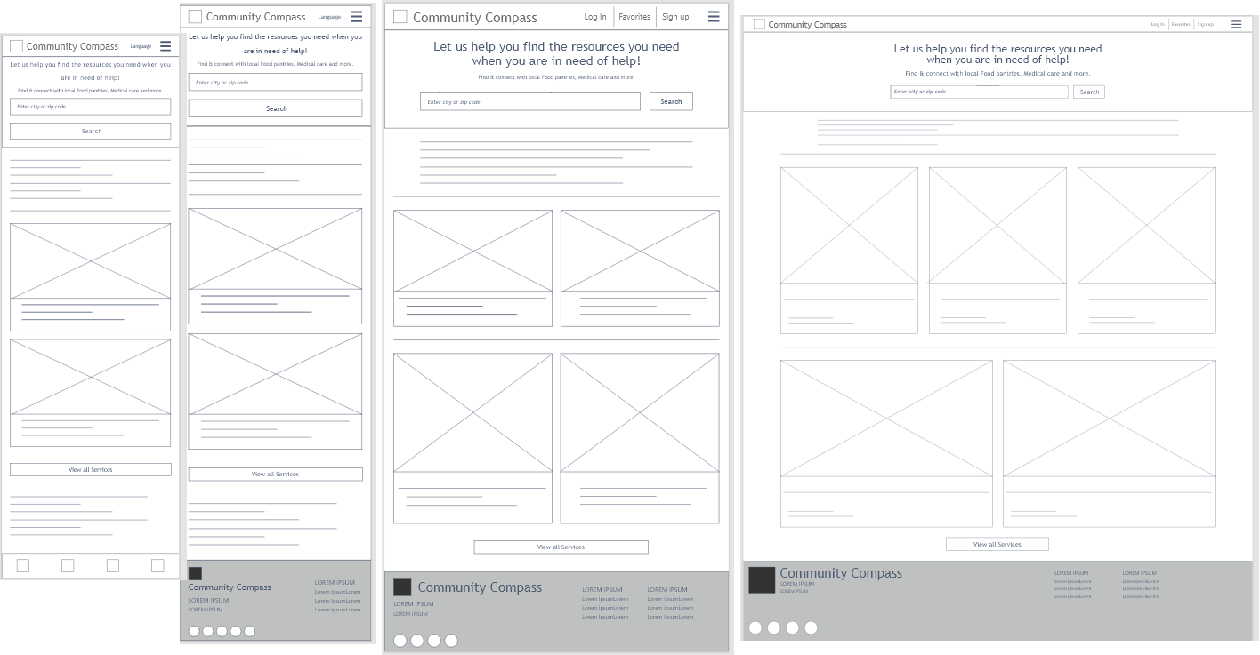
DIGITAL WIREFRAMES - SCREEN SIZES
Moving from paper to digital wireframes made it easy to understand how structuring the website could address user pain points and improve the user experience. Providing a responsive design would ensure that users could have access to Community Compass at home or on the go.
Wireframes of homepage for App and Website for phone, tablet, and computer.
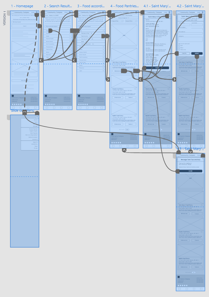
LOW - FIDELITY PROTOTYPE
To create a low-fidelity prototype, I connected all of the screens involved in the primary user flow of searching for resources in a user’s local area, selecting the assistance needed, viewing details of a specific facility, and contacting the facility.
Low-Fidelity prototype flow for user testing.
USABILITY STUDIES
Study Type: Unmoderated Location: United States, Remote Participants: 5 Length: 30-45 Min
USABILITY STUDY FINDINGS
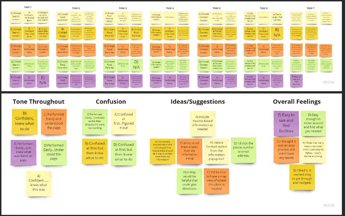
I conducted two rounds of usability studies. Findings from the studies proved to be an overall positive experience except for some confusion on contacting a facility and users had great feedback on additional items that could be added to the facility information dialog. Filtering, searching, viewing, and navigation were all received positively.
AFFINIY DIAGRAM
MOCKUPS
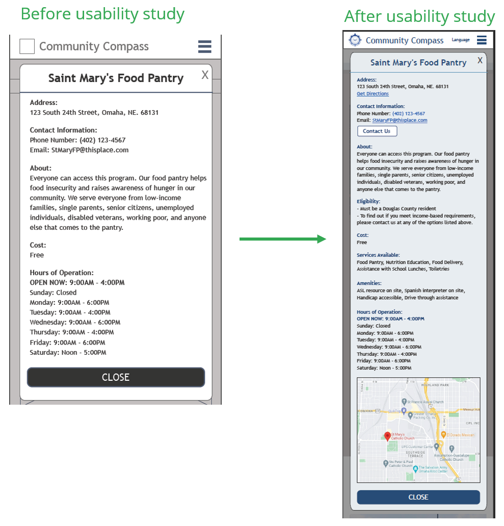
Based on the completed affinity diagram, identified themes, and prioritized insights from the usability study, I began to create the mockups from my low-fidelity prototype that addressed the confusing process of contacting a facility, added a map, eligibility concerns, and included the suggestions provided from the users.
Mockup of facility information popup dialog for phone after usability testing insights and feedback.
Mockups of homepage for phone and tablet.
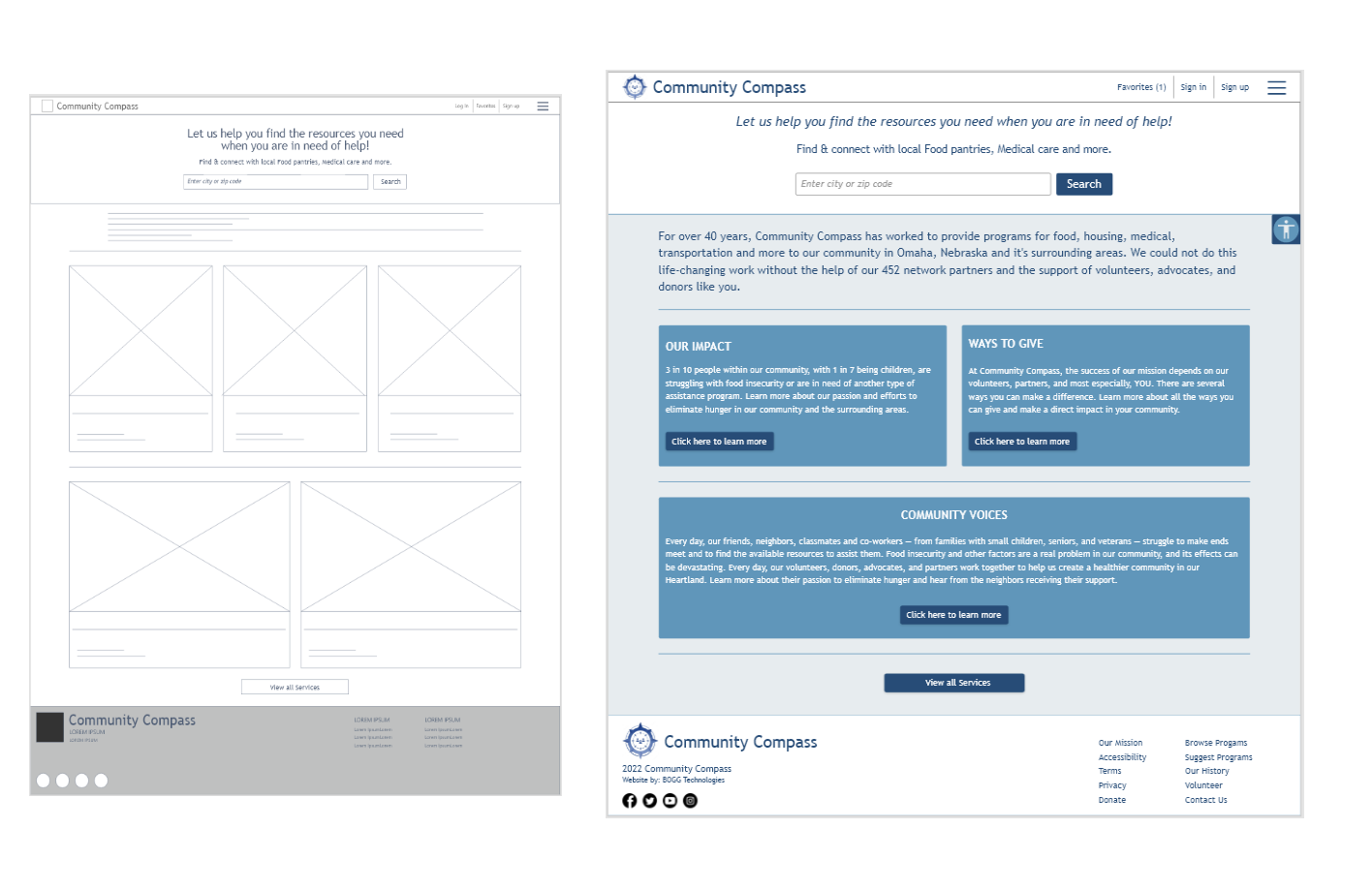
Mockup of homepage for computer.
Tab structure and dropdown menu for user to select the type of assistive resource needed.
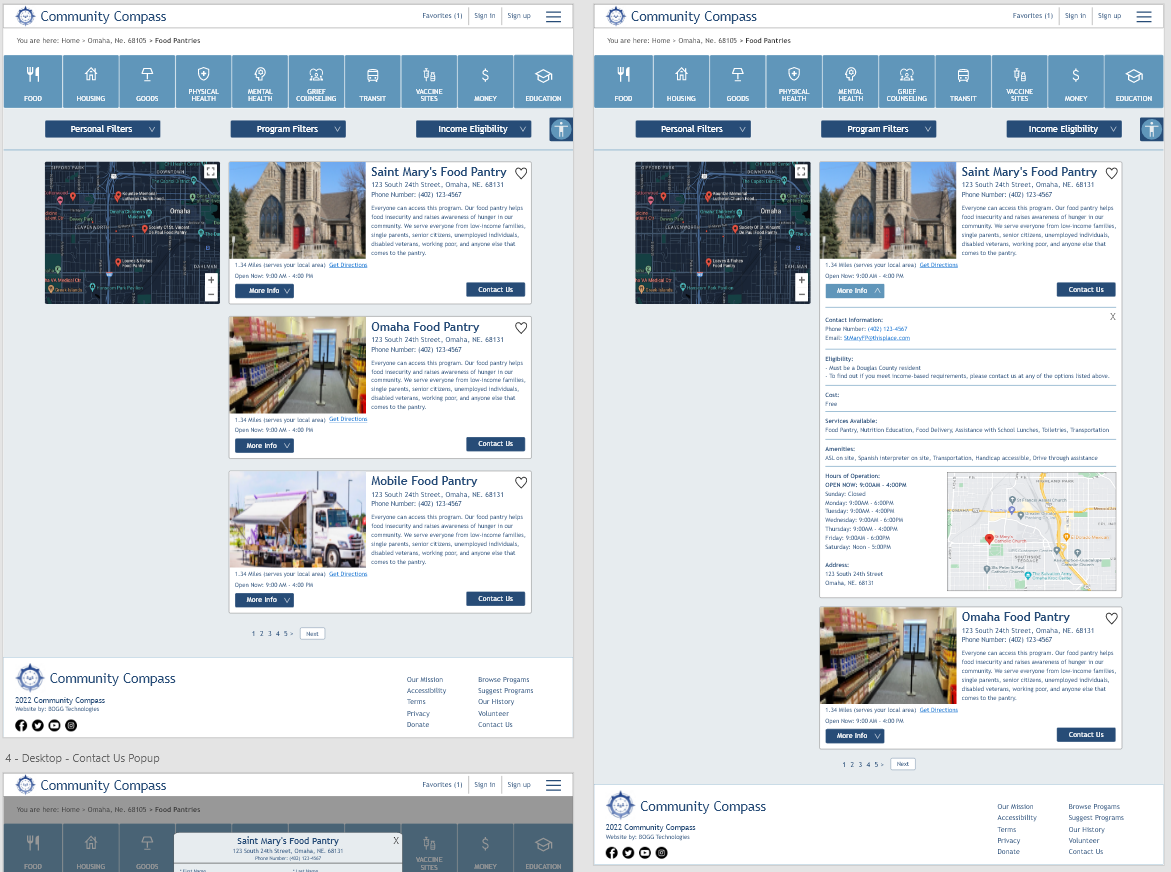
Mockups of computer screen for results page and expanded information on a specific facility.
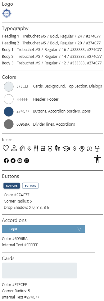
UI ELEMENTS
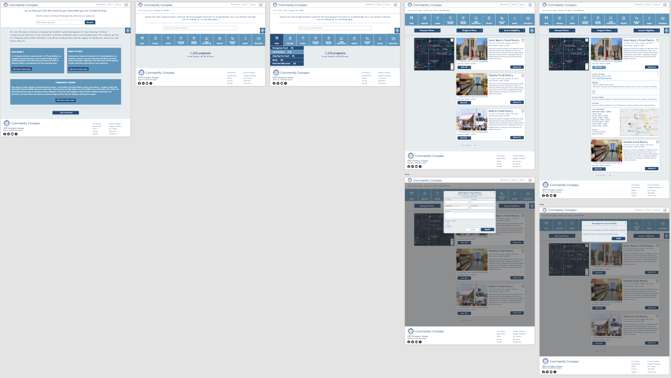
HIGH - FIDELITY PROTOTYPE
The final high-fidelity prototype followed the same user flow as the low-fidelity prototype and had a clean user flow. This also including the design changes made after the usability study.
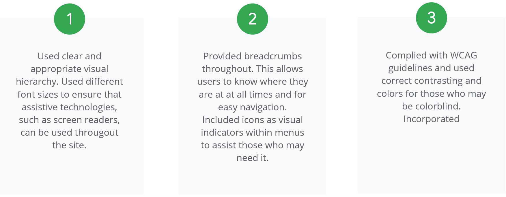
ACCESSIBILITY CONSIDERATIONS
REFLECTION
IMPACT
Users shared that the app made finding a local resource facility easy and that they would use this app to find resources when needed. Users stated the design was easy to navigate through and that they did not feel overwhelmed.
WHAT I LEARNED
I learned that even though the problem I was trying to solve was a big one, diligently going through the steps of the design process and aligning with specific user needs helped me come up with solutions that were both feasible and useful.
NEXT STEPS
Conduct follow up usability testing to validate whether the initial pain points were effectively addressed and to ensure no other newly discovered pain points have occurred.
Identify any additional areas of need and ideate on new features.

