Apartment Agent
Finding your dream apartment isn’t always an easy task. The process can be stressful and overwhelming at times. My aim for Apartment Agent was to make the process a more enjoyable and seamless experience. Apartment Agent was a complete concept project. From the research to the ideation to the final creation of the product. I kept my users in front.
PROJECT OVERVIEW
PRODUCT
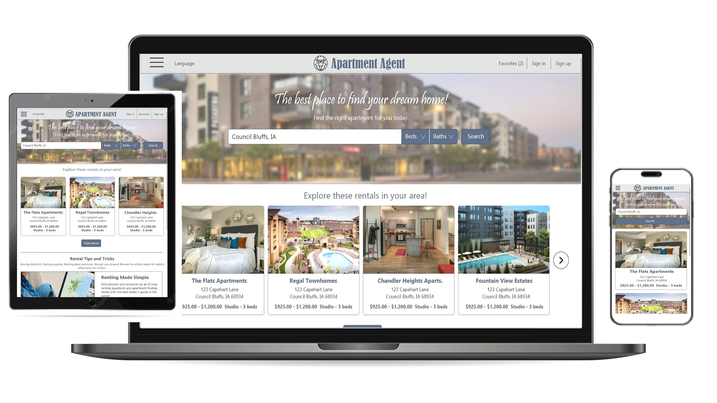
Apartment Agent is a responsive website designed to make the apartment searching process a pleasurable experience for for individuals actively looking for an apartment or for those who have gone through the process before. Our site includes easy and clear navigation throughout, robust filtering, ample amount of pictures of available apartments and their properties, ability to schedule in-person tours, and monthly pricing rates that provide include utilities and any other features.
MY ROLE AND RESPONSIBILITIES
I was the only designer involved in this project and completed everything from research, ideating, creating prototypes, conducting user testing, and creation of the high-fidelity prototypes.
PROJECT DURATION
2.0 Months
PROBLEM
Searching apartments for rent can be a daunting process. Most websites include minimal pictures of properties and only provide virtual tours. Availability of apartments are unclear and often times, finding monthly rental amounts and/or items included in monthly rent can be difficult.
GOAL
Create a responsive website that allows users to search for available apartments on a pc, tablet or phone quickly and easily. Provide users with easy navigation throughout, pictures of apartments, virtual and in-person tours (by schedule), accurate availability of apartments all while providing rent costs with any costs/utilities included in monthly rent rates.
UX DESIGN PROCESS
UX RESEARCH SUMMARY
I conducted interviews and created empathy maps to understand the users I’m designing for and their needs. A primary user group identified through research was working adults who don’t have much free time outside of their jobs.
The user group confirmed initial assumptions about navigating and locating available apartments, but research also revealed that time was not the only factor limiting users from using the website. Other user problems were lack of available pictures, inconsistent availability of apartments, inability to do an in-person tour and being unsure of monthly rent costs and what, if any items were included in that monthly rate.
USER RESEARCH: PAIN POINTS
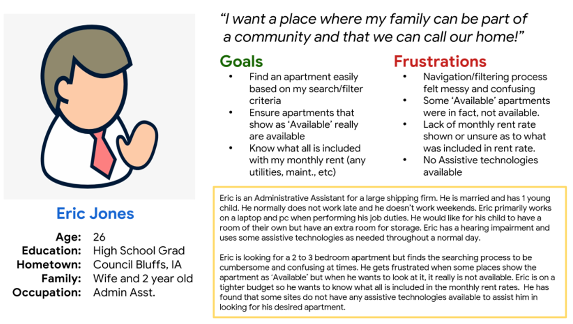
PERSONAS
PROBLEM STATEMENT
Eric is a busy Administrative Asst. He is married and has a young child. Eric gets frustrated with the complexity of some websites when looking for an apartment. He is on a fixed income and is looking for apartments that truly are available and provide additional monthly rent rate options.
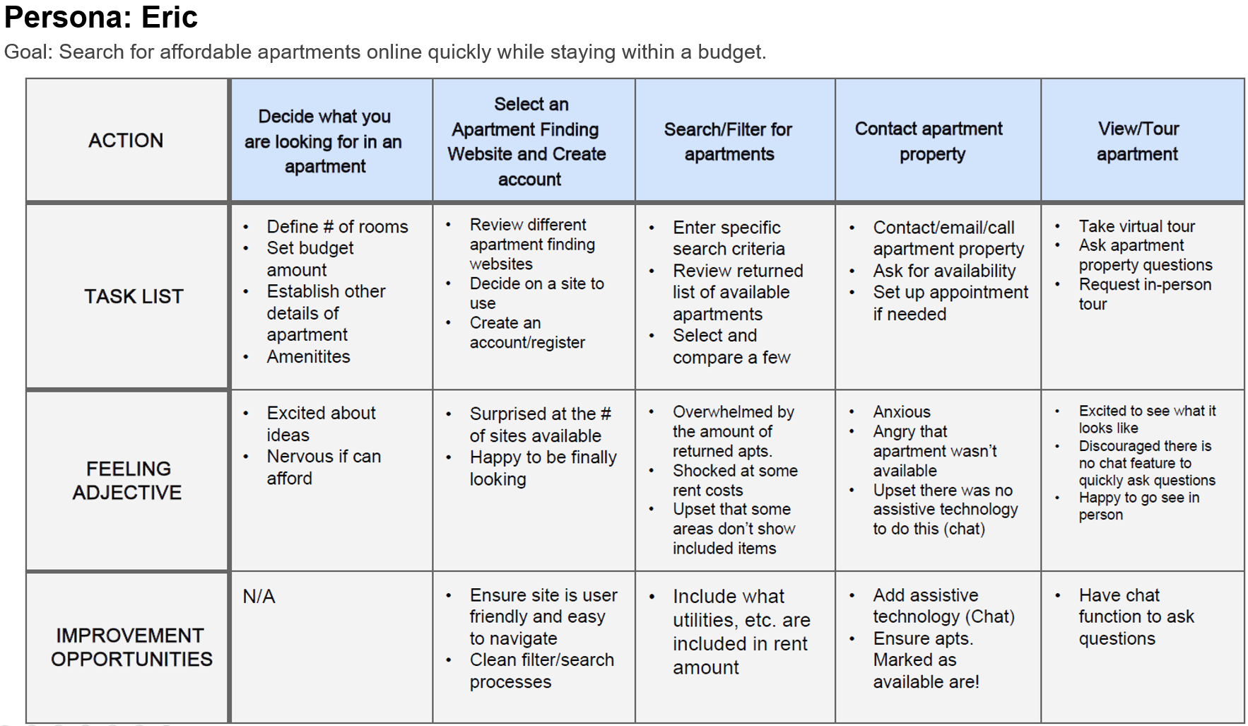
USER JOURNEY MAP
I created a user journey map of Eric’s apartment searching experience to help identify possible pain points and improvement opportunities.
STARTING THE DESIGN
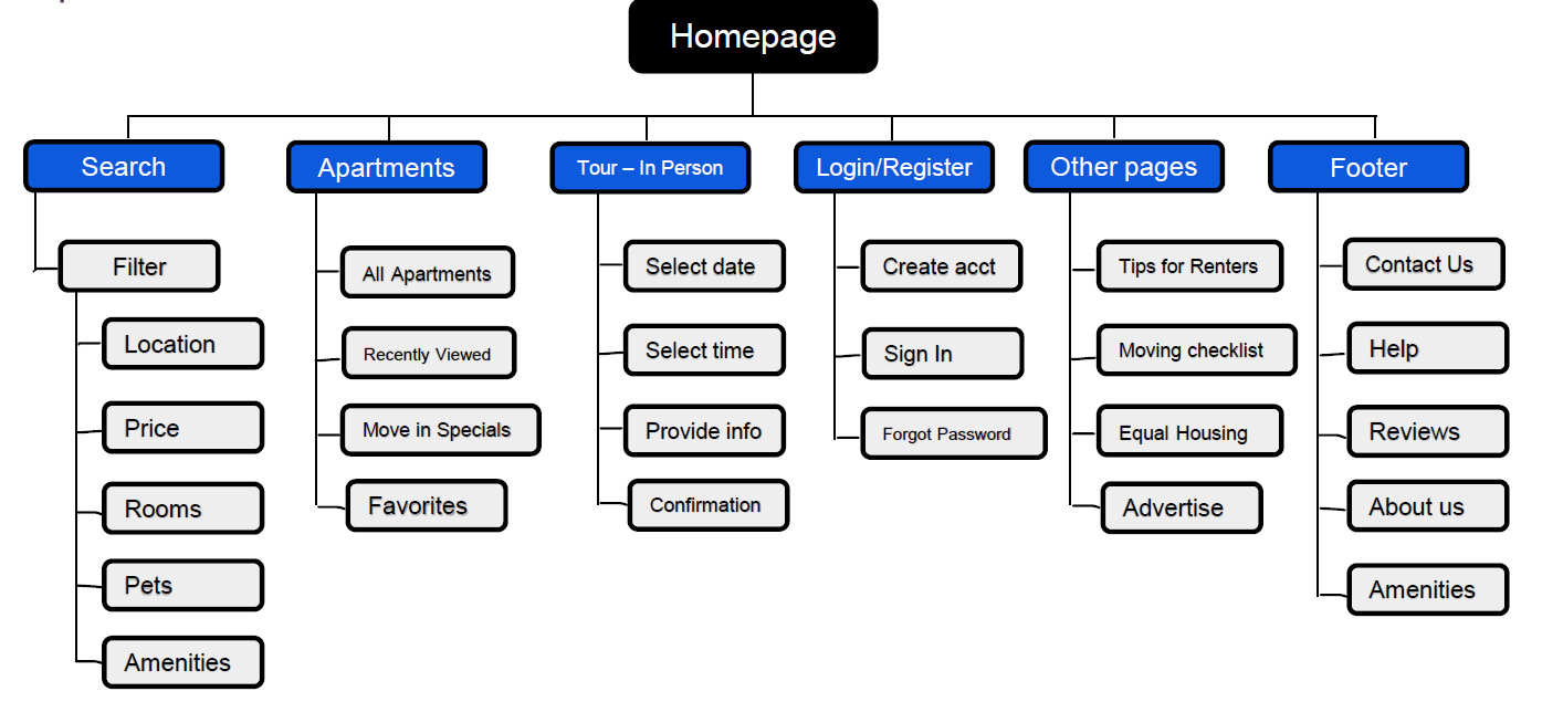
SITEMAP
My goal was to add new features that would address users pain points and would improve the overall website navigation. The hierarchal structure I chose was designed to make navigation simple and easy.
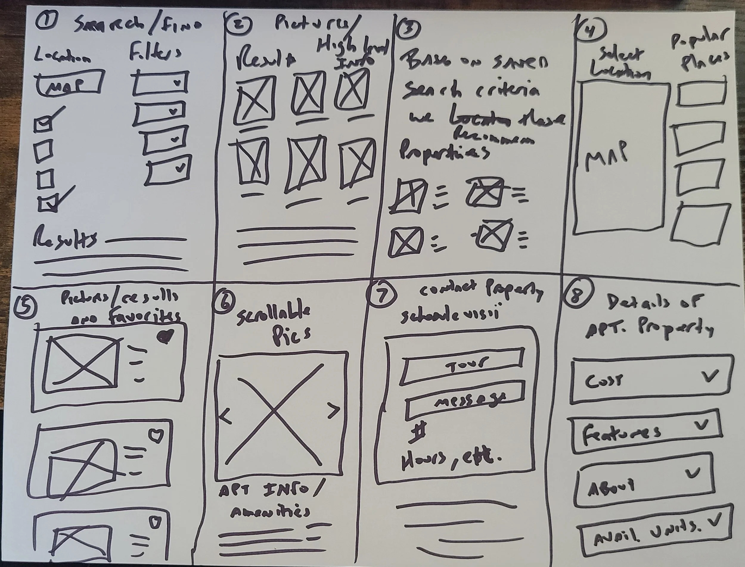
IDEATION - CRAZY 8
I did an ideation exercise called crazy 8 in order to come up with ideas that would help solve users pain points, such as make the search and filter process more robust, ability to all items covered in rent cost, maps to show locations, and to schedule a tour or message the property.
PAPER WIREFRAMES
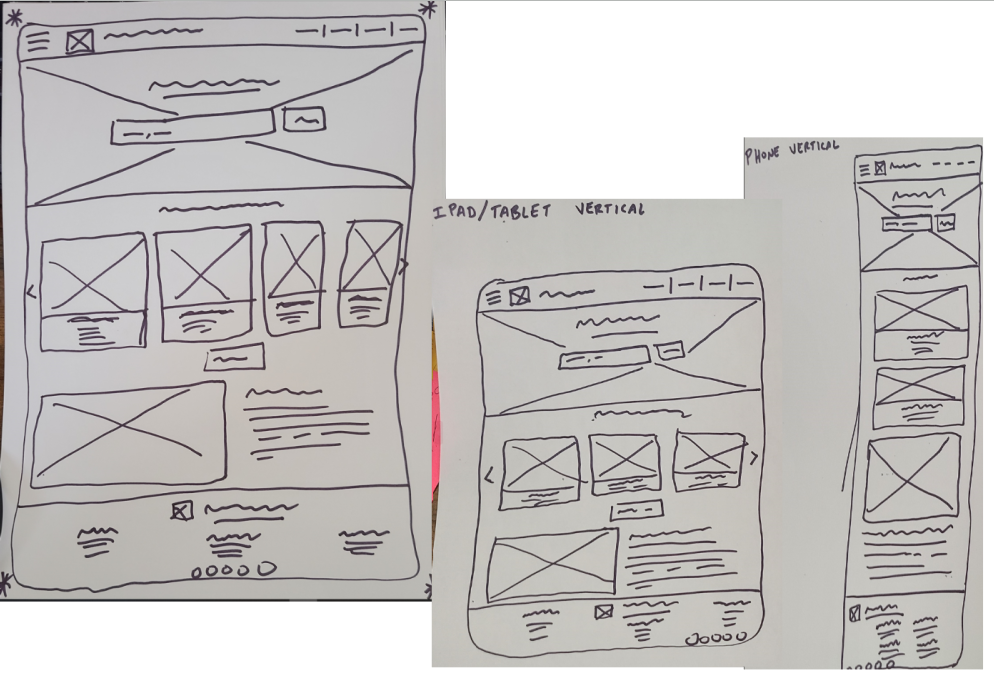
I then sketched out paper wireframes, keeping the user pain points about the new features and navigation in mind.
Because users access the site on a different devices and different screen sizes, I created designs for additional screen sizes to make sure the site would be fully responsive and a great user experience.
Paper wireframes of computer, tablet, and phone.
DIGITAL WIREFRAMES - SCREEN SIZES
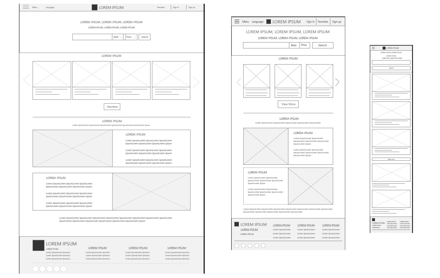
Moving from paper to digital wireframes made it easy to understand how structuring the website could address user pain points and improve the user experience.
My strategy was to make the searching and filtering experience as clear and easy to understand as possible.
Digital wireframes of computer, tablet, and phone.
LOW - FIDELITY PROTOTYPE
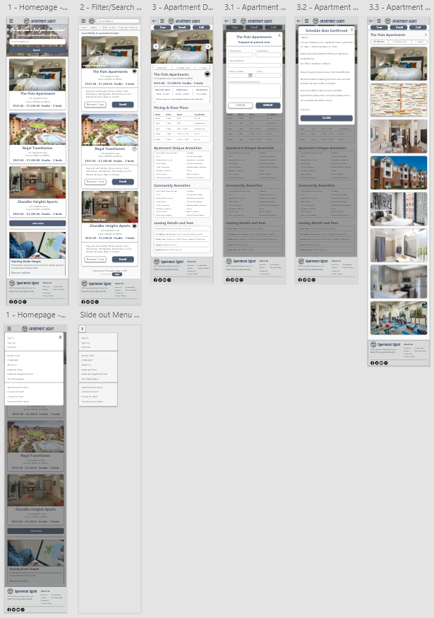
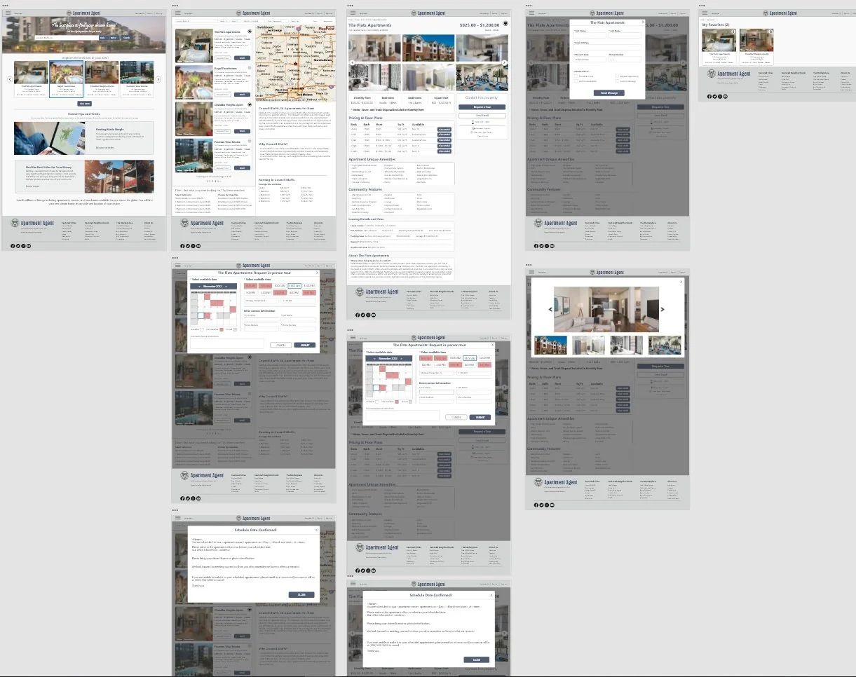
To create a low-fidelity prototype, I connected all of the screens involved in the primary user flow of searching for an apartment, view the details of a specific apartment, and schedule an appointment for an in-person tour.
USABILITY STUDIES
Study Type: Unmoderated Location: United States, Remote Participants: 5 Length: 20-30 Min
USABILITY STUDY FINDINGS
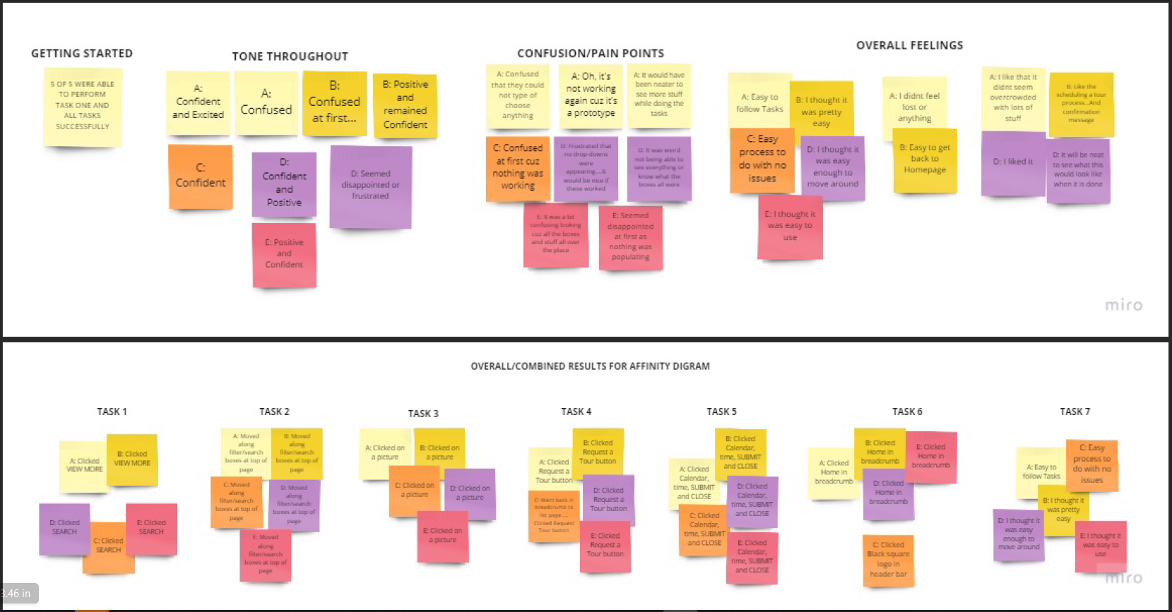
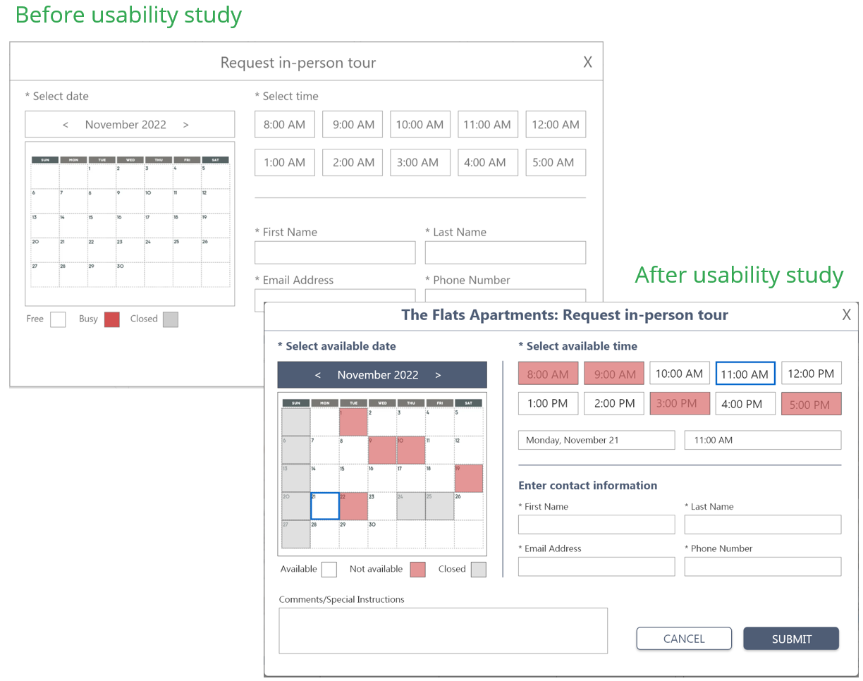
I conducted one round of usability studies. Findings from the study proved to be an overall positive experience except for needing more clarification on the scheduling on an in-person tour process. Filtering, searching, viewing, and navigation were all received positively. Based on that feedback, one round of user tesing was performed.
AFFINITY DIAGRAM
MOCKUPS
Based on the affinity diagram, identified patterns, and prioritized insights from the usability study, I made changes to improve the scheduling page functionality. One of the changes I made was adding ‘videos’ and ‘virtual tours’, add divider lines, and a Notes/Comments box to the scheduling dialog.
Before and after of schedule an in-person tour dialog.
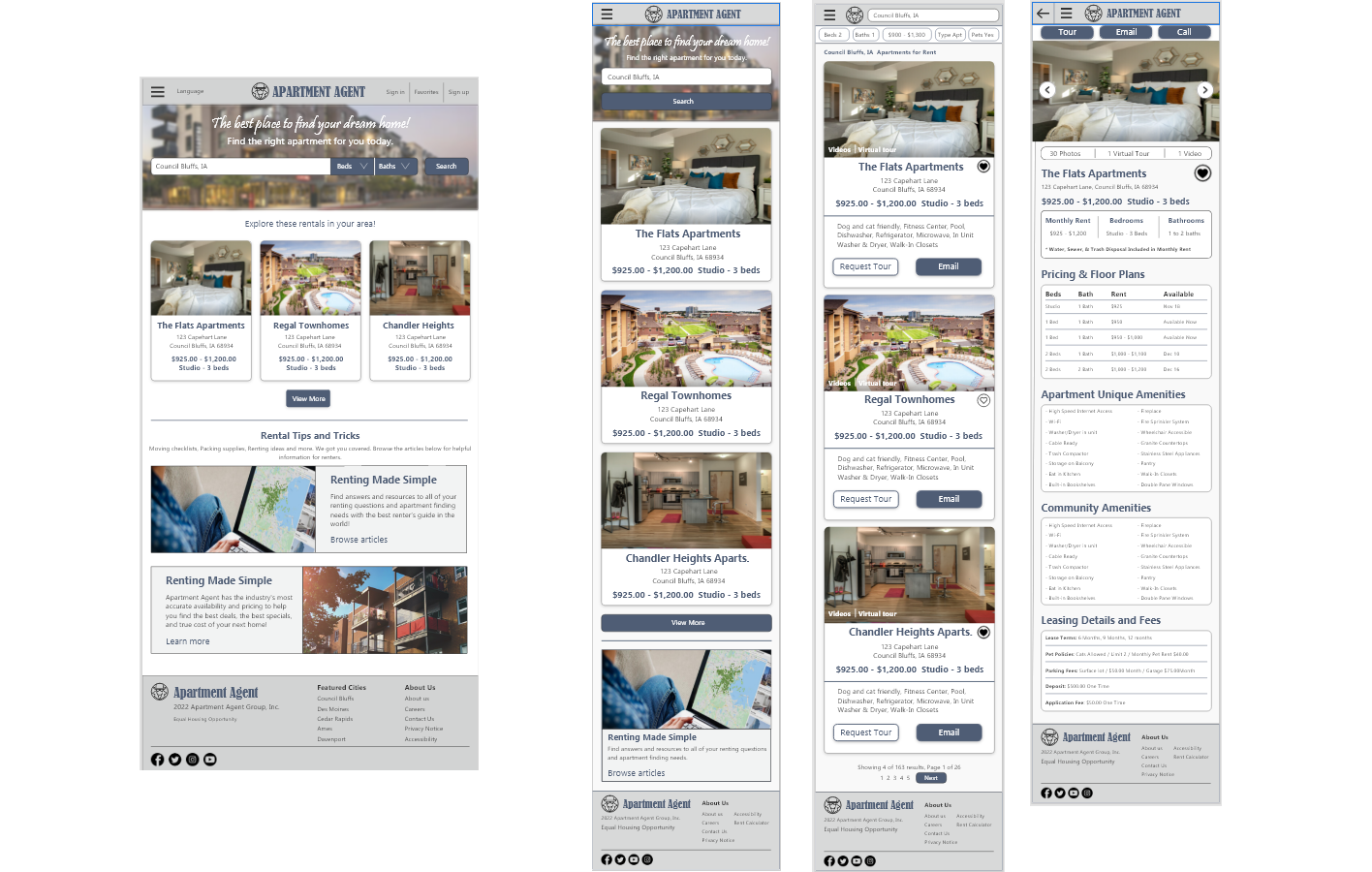
Mockups for homepage and results screen for computer.
MOCKUPS FOR MOBILE VERSIONS
I included considerations for additional screen sizes in my mockups based on my earlier wireframes. Time plays a huge factor when searching for an apartment. I felt it was important to optimize the browsing experience for mobile devices as well.
Mobile mockups for tablet and phone.
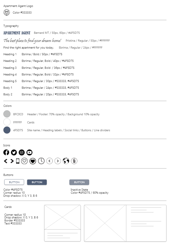
UI ELEMENTS
HIGH - FIDELITY PROTOTYPE
My high-fidelity prototype followed the same user flow as the low-fidelity prototype, including the design changes made after the usability study.
ACCESSIBILITY CONSIDERATIONS
REFLECTION
IMPACT
Taking into account the different screen sizes, how the interaction on each may be different, and functionality of the content for each layout will be key to ensuring an optimal experience for any user across all devices
WHAT I LEARNED
I learned that even small design changes can have a huge impact on the overall user experience. The most important takeaway for me is to always focus on the real needs of the user when coming up with design ideas and solutions.
NEXT STEPS
Conduct new usability testing and iterate on design if necessary.
Identify any additional areas of need and ideate on new features.
